A rare and endangered group of maps emerges the morning after an election, only to disappear as soon as the news cycle moves on. You know, these guys:

Left to right, top to bottom: New York Times 2018, The Guardian 2018, New York Times 2016, Bloomberg 2018.
Wait! Come back! I miss you!
These maps punch way above their weight. I’d like to take a closer look at what they do and why they work. In the absence of another name, I am calling them hedgehog maps.
Hedgehog maps use arrows to indicate change, with the base of the arrow showing the location of the change, the length indicating the magnitude of the change, and the angle indicating the direction. They’re distinct from flow maps, which use arrows to link two locations, and arrow plots, which uses the base of the arrow to indicate a starting value and the arrowhead to indicate a finishing value.
The result is striking, as intuitive as it is unquantifiable. Look at The Guardian’s map of changes in vote share during the 2018 midterm elections:

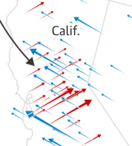
I couldn’t tell you how many districts tended more towards the Democrats in 2018 than in 2016, or how large the average change was. But as soon as I look at the map, I know that lots of districts swung left, and that districts within the same states changed in different ways. Areas that shifted in the same direction seem to move as a unified body, resembling the oft-discussed blue wave:

In contrast, map bristles like a hissing cat when districts move in different directions. Arrows criss-cross and create an image as unsettled as the political landscape:
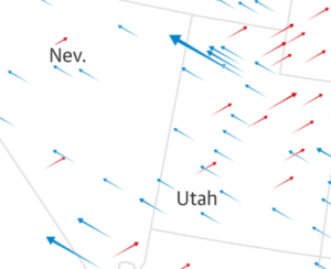
Areas that stayed largely the same, or that have fewer districts, fade into the background. Look at Nevada and the parts of Utah that aren’t Salt Lake City:
The audience has to pull a lot of weight in order to understand a hedgehog map. It’s difficult to judge the length of unaligned line segments! However, the rest of the map is designed to make this task as easy as possible. The arrowheads give an intuitive sense of motion to communicate the direction of change. Left and right have strong associations with political parties in the U.S.
Hedgehog maps keep angle and color simple as well. Either angle or color could communicate a range of values, but instead they are grouped into two options: left or right? Blue or red? Color and angle are also redundant with each other. Every district that swung Democratic is leftward and blue. Every district that swung Republican is rightward and red.
It is technically possible to add a few other variables (with arrow width, for instance, or the size of the arrow head), but I have real doubts about how much more information anyone could interpret from these maps. The original designers appear to agree: all four maps highlighted above keep their visual encoding simple and redundant in the same ways.
Arrows are a particularly effective symbol: they suggest motion, indicate origin points, and suggest two opposing sides. Sometimes motion is real, rather than a suggestion. See the third chart in this scrollytelling story, or the constant animation in this 2012 election map (which, fair warning, makes me a little seasick). Even in a static graphic, an arrowhead suggests a direction. Arrowheads are also key for indicating which part of the arrow is rooted in a physical location, and which end shows the amount of change. In contrast, take a section of this map from the Washington Post, which uses plain lines to show partisan swing in the 2016 elections:
(If you’re having trouble reading this, the country has been rotated, with the Northeast in the upper left and Florida in the lower right.)
I genuinely can’t tell which part of the line is supposed to show the location of a county. It also takes a lot longer to make sense of what I’m seeing. I know that angle corresponds to the amount and direction of the swing, and that bolded lines flipped from one party to another, but I have to stop and consciously decode each state.
The same article also demonstrates the perils of using arrowheads without arrows, in a map that uses peaks to show margins of victory:
 Again, I find this pretty had to read. It’s difficult to detangle and separately interpret the height, width, and stroke of a triangle. The more populous or partisan a county, the larger the peak, and the more ambiguous the location of the county becomes.
However, shapes other than arrows can work, as demonstrated by this graphic of shifting springtime:

The trick here may be the use of two specific angles, rather than using angle to indicate a range of values like the line graphic. The direction of change is also reinforced by fill color. It’s still hard to pinpoint what part of the country is indicated by any given mark, but the overall pattern is much easier to understand.
The leaf shapes in the spring map are gentler than the arrows in the election maps, but both contribute to a sense of conflict between two directions. The symbols in hedgehog maps point in opposing directions, so the changes that they represent should be in opposition too. When a county becomes more Republican, it must also become less Democratic. If spring begins earlier, it must also begin less-late. That conflict should reflect the content of the map instead of just being an artifact of the design.
It’s also key for the directions of the symbols to have a strong, intuitive tie to their meaning. Political parties are an easy example, because “left wing” and “right wing” are so deeply engrained in American political culture. And timelines commonly proceed from left to right, so it’s easy to read left as “early” and right as “late” in the spring map.
For a counter-example, check out a draft visualization shared by Matt Daniels of The Pudding, which uses arrows to indicate gender (im)balance:
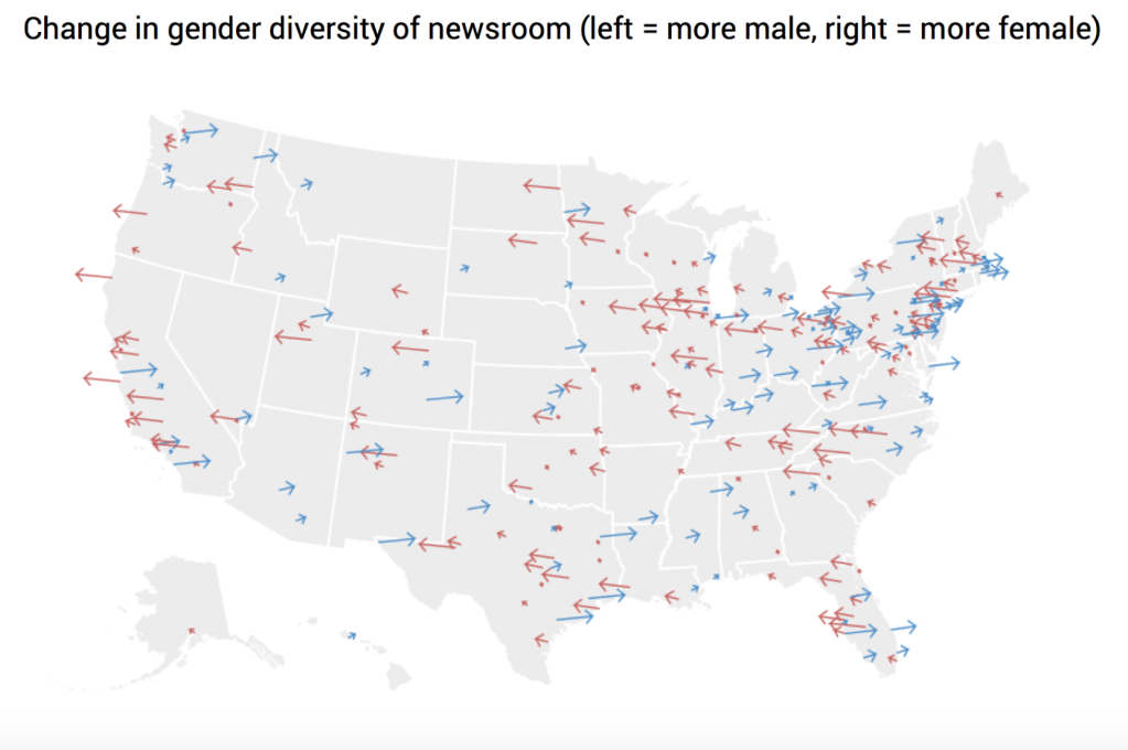
Left means more male, right means more female, and I cannot for the life of me remember which is which without checking the title. (This visualization later became a very cool beeswarm plot. I’m not dunking on Daniels here or trying to discourage the sharing of drafts–just showing an example of what happens when directions don’t have intuitive meanings.)
Left and right have somewhat limited meanings, but they aren’t the only option. Bloomberg used vertical arrows to show changes in voter turnout:
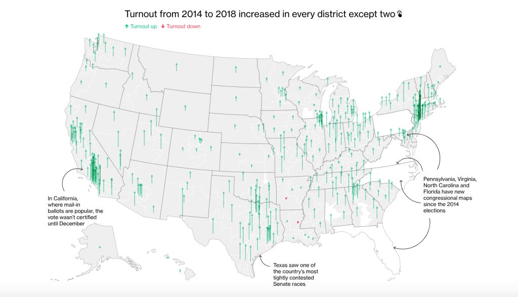
Vertical arrows could be used for any increase or decrease, even outside the election cycle.
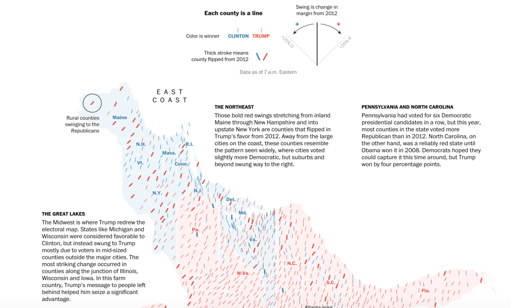
As fond as I am of hedgehog maps, they do have their limits and dangers. Since these maps show change, they should be explicit about their baselines for comparison and what that change means. For instance, a rightward swing doesn’t mean that a district flipped from Democratic to Republican representation. The county may already have had a Republican representative, or the swing may not have been large enough to flip the seat. So does the map show swings everywhere, or just in places where a seat flipped from one party to another?
No one graphic can meet every need, though, so the best answer may be multiple views of the same data. For their 2018 midterm coverage, the New York Times included many charts in one story, including maps of all changes, maps of flipped seats, and bar charts showing precise changes.
Hedgehog maps can be used to visualize change whenever something becomes larger or smaller, earlier or later. If it’s important to show precise values or quantities, a bar or arrow chart is probably a better bet. However, hedgehog maps are a striking way to show patterns of change across geographic areas. I hope they’ll get a little more play, above and beyond American election cycles.
Post edited in response to reader feedback. Thanks, Noah!
