For your consideration, swords:
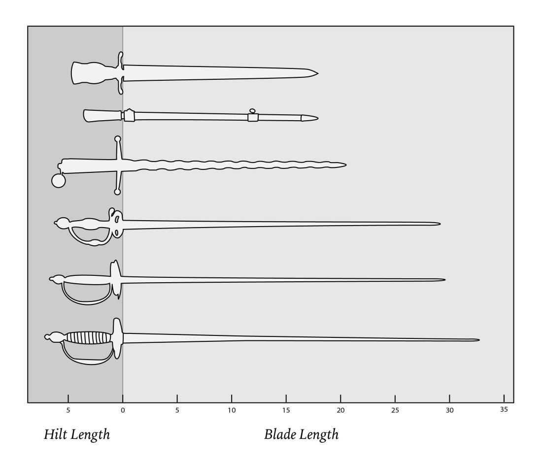
The sword graph was a bit of self-indulgent fun, but it did give me an opportunity to reflect on graph humor and the appeal of self-encoding. I created the term “self-encoding” to describe charts where the object being described represents (or encodes) itself, rather than being translated into a more abstract image like a bar or a dot. Self-encoding preserves important quantitative information (such as the length of a hilt) while also presenting additional qualitative information (the presence or absence of a pommel, the shape of the crossguard).
Sometimes self-encoding is just for fun. Consider these two classics of graph humor:
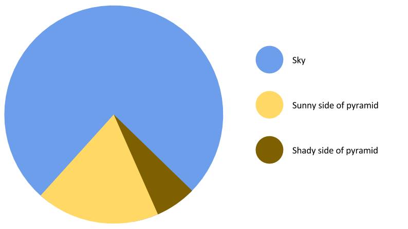
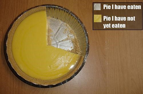
(Original sources lost to the mists of the Internet, but found here and here.)
There is a certain “can’t-argue-with-that” charm to self encoding. They read like visual tautologies: the part of the chart that looks like a pyramid is encoded by the part of the chart that looks like a pyramid, the remaining pie is encoded by the remaining pie, the length of the blade is encoded by the length of the blade.
I will freely admit that my graph was a stab at comedy, rather than an attempt to communicate information about the British Museum’s collection of eighteenth-century swords. But self-encoding can be useful beyond the humor of unexpected juxtapositions. Take the self-encoded graphic of the lifecycle of a Japanese beetle:
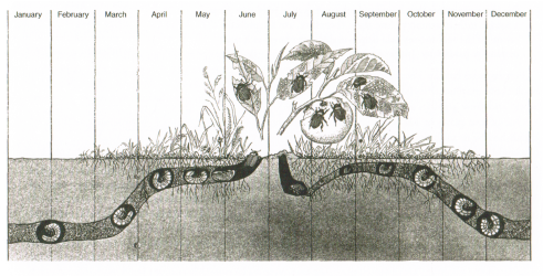
(Originally printed in Man and Insects by L. Hugh Newman ,scanned from The Visual Display of Quantitative Information by Edward Tufte.)
The beetle’s position underground throughout the year is represented as, well, the beetle’s position underground. However, by portraying the beetle itself rather than a more abstract dot, line, or bar, the graphic communicates the creature’s size, positioning, and development throughout the year.
Self-encoded charts are closely related to diagrams: both communicate qualitative details while illustrating an organism or item. However, self-encoding goes a step further by arranging images in a way that facilitates data visualization tasks like comparison or the detection of patterns and outliers.
Self-encoded charts also have a surface resemblance to pictographs, but they take matters a step further. Take the following (entirely fictional) pictograph:

The point of the pictograph is not that each potentially-sworded person has two arms and two legs and a mysterious floating head. These details make the icons instantly recognizable as people, but they’re superfluous to the quantity being shown. In a self-encoding chart, the details are the information being shown. In contrast, self-encoded images communicate some quality beyond quantity. One of the upsides of self-encoding is the ability to examine details that haven’t been directly measured. For instance, check out this 1864 diagram of river length, encoded by the actual rivers:
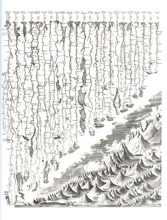
(Originally printed in Johnson’s New Illustrated Family Atlas with Physical Geography by Joseph Hutchins Colton)
The St. Lawrence River (the one with all the lakes) and the Niger River (directly to the right of the one with all the lakes) are very similar in length, but could not be more different in terms of intersection with other bodies of water. The main piece of information communicated by this chart is river length, but self-encoding also reveals river shape, tributaries, and settlements along the way.
Self-encoding for humor is inherently limited: it works when classical graphical elements are repurposed by encoding an image’s area, length, or position as area, length, or position. However, some of the benefits of self-encoding, such as quick recognition and intuitive understanding, can be recreated in surprising and serious contexts. In this diagram of increasing political polarization, the ideological distance between American political parties is shown as actual distance:
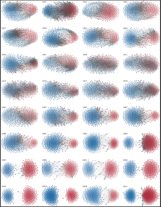
(From “The Rise of Partisanship and Super-Cooperators in the U.S. House of Representatives” by Andis et al.)
This isn’t the plain-spoken humor of the sword graph: partisanship is a complex measure, subject to all kinds of transformation between observation and visualization. But the graphic makes instant intuitive sense by linking an abstract measure of distance with literal distance on the page, and showing the transition from muddy-colored cooperation into pure hues as the parties retreated further into ideological purity.
Self-encoding can dramatically increase a graphic’s information density in cases where one mark represents one sword (or one stage of a beetle’s life cycle, or one river, or one segment of actual pie). However, self-encoding also enforces a sort of information un-density. The technique is useful because it adds qualitative details. On the other hand, it is only useful when details are visible and recognizable, and therefore not suitable for trying to show a large quantity of data points.
Even when it is usable, self-encoding isn’t always appropriate as a tool. In the river example above, the kinks and turns of the rivers obscure their true lengths: someone who wanted to know precisely how long the Niger River is would have to turn elsewhere. The sword graph also only works because I could pick and choose between eighteenth-century blades. If I needed to include this curved sword, for instance, I couldn’t compare blade lengths by slapping a picture of it next to the straight-bladed swords. Like all visualizations techniques, self-encoding is useful for specific tasks with specific audiences.
Self-encoding also requires some careful choices around imagery: what is communicated when an image is simplified down to its most iconic form, versus when it is shown in photorealistic detail? Sword Graph: Part II will explore those choices by taking a dive into visual perception and comic books.
Having acknowledged the weaknesses of self-encoding, I can now acknowledge that I am completely charmed by it. Watch this space for more illustrations in unexpected places. And if you’re interested in the British Museum’s eighteenth-century swords (they’re all real, even the wiggly one!), you can find them here.

One thought on “Sword Graphs Part I: Self-Encoding”